Evaluating Shape Alignment via Ensemble VisualizationThe visualization of variability in 3D shapes or surfaces, which is a type of ensemble uncertainty visualization for volume data, provides a means of understanding the underlying distribution for a collection or ensemble of surfaces. While ensemble visualization for surfaces is already described in the literature, we conduct an expert-based evaluation in a particular medical imaging application: the construction of atlases or templates from a population of images. In this work, we extend contour boxplots to 3D, allowing us to evaluate it against an enumeration-style visualization of the ensemble members and also other conventional visualizations used by atlas builders, namely examining the atlas image and the corresponding images/data provided as part of the construction process. [paper] |

|
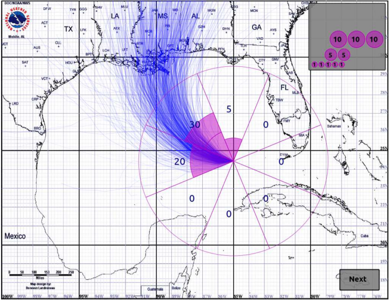
Visually Comparing Weather Features in ForecastsMeteorologists process and analyze weather forecasts using visualization in order to examine the behaviors of and relationships among weather features. In this design study conducted with meteorologists in decision support roles, we identified and attempted to address two significant common challenges in weather visualization: the employment of inconsistent and often ineffective visual encoding practices across a wide range of visualizations, and a lack of support for directly visualizing how different weather features relate across an ensemble of possible forecast outcomes. In this work, we present a characterization of the problems and data associated with meteorological forecasting, we propose a set of informed default encoding choices that integrate existing meteorological conventions with effective visualization practice, and we extend a set of techniques as an initial step toward directly visualizing the interactions of multiple features over an ensemble forecast. We discuss the integration of these contributions into a functional prototype tool, and also reflect on the many practical challenges that arise when working with weather data. [paper] |

|
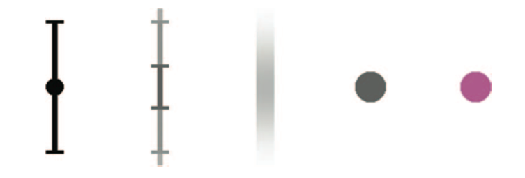
The Influence of Different Graphical Displays on Nonexpert Decision Making Under UncertaintyUnderstanding how people interpret and use visually presented uncertainty data is an important yet seldom studied aspect of data visualization applications. Current approaches in visualization often display uncertainty as an additional data attribute without a well-defined context. Our goal was to test whether different graphical displays (glyphs) would influence a decision about which of 2 weather forecasts was a more accurate predictor of an uncertain temperature forecast value. We used a statistical inference task based on fictional univariate normal distributions, each characterized by a mean and standard deviation. Participants viewed 1 of 5 different glyph types representing 2 weather forecast distributions. Three of these used variations in spatial encoding to communicate the distributions and the other 2 used nonspatial encoding (brightness or color). Four distribution pairs were created with different relative standard deviations (uncertainty of the forecasts). We found that there was a difference in how decisions were made with spatial versus nonspatial glyphs, but no difference among the spatial glyphs themselves. Furthermore, the effect of different glyph types changed as a function of the variability of the distributions. The results are discussed in the context of how visualizations might improve decision making under uncertainty. [paper] |
|
Visualizing Time-Specific Hurricane Predictions, with Uncertainty, from Storm Path EnsemblesThe U.S. National Hurricane Center (NHC) issues advisories every six hours during the life of a hurricane. These advisories describe the current state of the storm, and its predicted path, size, and wind speed over the next five days. However, from these data alone, the question “What is the likelihood that the storm will hit Houston with hurricane strength winds between 12:00 and 14:00 on Saturday?” cannot be directly answered. To address this issue, the NHC has recently begun making an ensemble of potential storm paths available as part of each storm advisory. Since each path is parameterized by time, predicted values such as wind speed associated with the path can be inferred for a specific time period by analyzing the statistics of the ensemble. This paper proposes an approach for generating smooth scalar fields from such a predicted storm path ensemble, allowing the user to examine the predicted state of the storm at any chosen time. As a demonstration task, we show how our approach can be used to support a visualization tool, allowing the user to display predicted storm position – including its uncertainty – at any time in the forecast. In our approach, we estimate the likelihood of hurricane risk for a fixed time at any geospatial location by interpolating simplicial depth values in the path ensemble. Adaptively- sized radial basis functions are used to carry out the interpolation. Finally, geometric fitting is used to produce a simple graphical visualization of this likelihood. We also employ a non-linear filter, in time, to assure frame-to- frame coherency in the visualization as the prediction time is advanced. We explain the underlying algorithm and definitions, and give a number of examples of how our algorithm performs for several different storm predictions, and for two different sources of predicted path ensembles. [paper] [30 sec. video] |

|
Curve Boxplot: Generalization of Boxplot for Ensembles of CurvesIn simulation science, computational scientists often study the behavior of their simulations by repeated solutions with variations in parameters and/or boundary values or initial conditions. Through such simulation ensembles, one can try to understand or quantify the variability or uncertainty in a solution as a function of the various inputs or model assumptions. In response to a growing interest in simulation ensembles, the visualization community has developed a suite of methods for allowing users to observe and understand the properties of these ensembles in an efficient and effective manner. An important aspect of visualizing simulations is the analysis of derived features, often represented as points, surfaces, or curves. In this paper, we present a novel, nonparametric method for summarizing ensembles of 2D and 3D curves. We propose an extension of a method from descriptive statistics, data depth, to curves. We also demonstrate a set of rendering and visualization strategies for showing rank statistics of an ensemble of curves, which is a generalization of traditional whisker plots or boxplots to multidimensional curves. Results are presented for applications in neuroimaging, hurricane forecasting and fluid dynamics. [paper] [30 sec. video] |
|
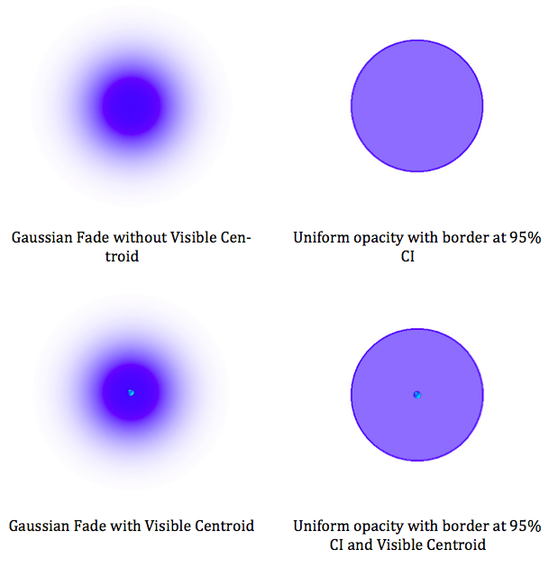
Assessing the effectiveness of different visualizations for judgments of positional uncertaintyMany techniques have been proposed for visualizing uncertainty in geospatial data. Previous empirical research on the effectiveness of visualizations of geospatial uncertainty has focused primarily on user intuitions rather than objective measures of performance when reasoning under uncertainty. Framed in the context of Google’s blue dot, we examined the effectiveness of four alternative visualizations for representing positional uncertainty when reasoning about self-location data. Our task presents a mobile mapping scenario in which GPS satellite location readings produce location estimates with varying levels of uncertainty. Given a known location and two smartphone estimates of that known location, participants were asked to judge which smartphone produces the better location reading, taking uncertainty into account. We produced visualizations that vary by glyph type (uniform blue circle with border vs. Gaussian fade) and visibility of a centroid dot (visible vs. not visible) to produce the four visualization formats. Participants viewing the uniform blue circle are most likely to respond in accordance with the actual probability density of points sampled from bivariate normal distributions and additionally respond most rapidly. Participants reported a number of simple heuristics on which they based their judgments, and consistency with these heuristics was highly predictive of their judgments. [paper] |
|
Contour Boxplots: A Method for Characterizing Uncertainty in Feature Sets from Simulation EnsemblesEnsembles of numerical simulations are used in a variety of applications, such as meteorology or computational solid mechanics, in order to quantify the uncertainty or possible error in a model or simulation. Deriving robust statistics and visualizing the variability of an ensemble is a challenging task and is usually accomplished through direct visualization of ensemble members or by providing aggregate representations such as an average or pointwise probabilities. In many cases, the interesting quantities in a simulation are not dense fields, but are sets of features that are often represented as thresholds on physical or derived quantities. We introduced a generalization of boxplots, called contour boxplots, for visualization and exploration of ensembles of contours or level sets of functions. Conventional boxplots have been widely used as an exploratory or communicative tool for data analysis, and they typically show the median, mean, confidence intervals, and outliers of a population. The proposed contour boxplots are a generalization of functional boxplots, which build on the notion of data depth. Data depth approximates the extent to which a particular sample is centrally located within its density function. This produces a center-outward ordering that gives rise to the statistical quan- tities that are essential to boxplots. Here we present a generalization of functional data depth to contours and demonstrate methods for displaying the resulting boxplots for two-dimensional simulation data in weather forecasting and computational fluid dynamics. [paper] [wiki] |
|
Visualizing Uncertainty in Predicted Hurricane Tracks
|
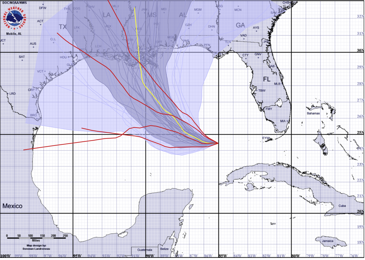
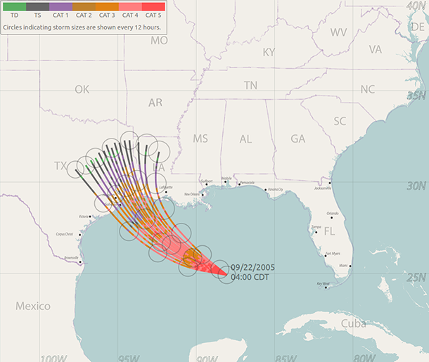
The error cone is a display produced by the National Hurricane Center in order to present its predictions of the path of a hurricane. While the error cone is one of the primary tools used by officials, and the general public, to make emergency response decisions, the uncertainty underlying this display can be easily misunderstood. This project explores the design of an alternate display that provides a continually updated set of possible hurricane tracks, whose ensemble distribution closely matches the underlying statistics of a hurricane prediction. We explain the underlying algorithm and data structures, and demonstrate how our displays compare with the error cone. Finally, we review the design and results of a user study that we conducted as a preliminary test of the efficacy of our approach in communicating prediction uncertainty. [paper] |
|
Effects of ensemble and summary displays on interpretations of geospatial uncertainty data
|
Ensemble and summary displays are two widely used methods to represent visual-spatial uncertainty; however, there is disagreement about which is the most effective technique to communicate uncertainty to the general public. Visualization scientists create ensemble displays by plotting multiple data points on the same Cartesian coordinate plane. Despite their use in scientific practice, it is more common in public presentations to use visualizations of summary displays, which scientists create by plotting statistical parameters of the ensemble members. While prior work has demonstrated that viewers make different decisions when viewing summary and ensemble displays, it is unclear what components of the displays lead to diverging judgments. This study aims to compare the salience of visual features – or visual elements that attract bottom-up attention – as one possible source of diverging judgments made with ensemble and summary displays in the context of hurricane track forecasts. We report that salient visual features of both ensemble and summary displays influence participant judgment. Specifically, we find that salient features of summary displays of geospatial uncertainty can be misunderstood as displaying size information. Further, salient features of ensemble displays evoke judgments that are indicative of accurate interpretations of the underlying probability distribution of the ensemble data. However, when participants use ensemble displays to make point-based judgments, they may overweight individual ensemble members in their decision-making process. We propose that ensemble displays are a promising alternative to summary displays in a geospatial context but that decisions about visualization methods should be informed by the viewer’s task. [paper] |
|
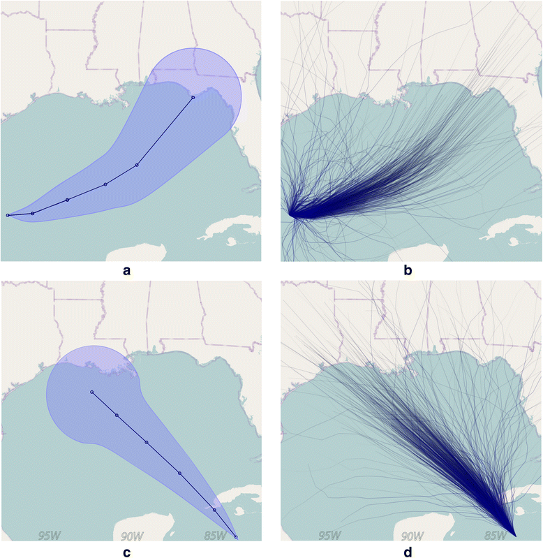
Visualizing uncertain tropical cyclone predictions using representative samples from ensembles of forecast tracks
|
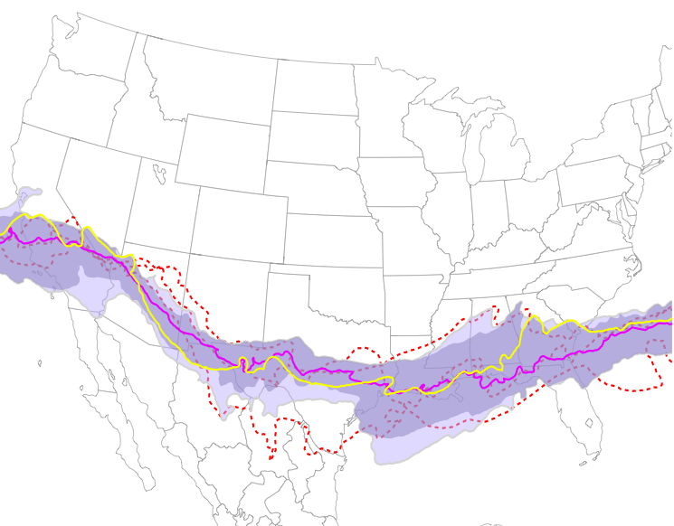
A common approach to sampling the space of a prediction is the generation of an ensemble of potential outcomes, where the ensemble’s distribution reveals the statistical structure of the prediction space. For example, the US National Hurricane Center generates multiple day predictions for a storm’s path, size, and wind speed, and then uses a Monte Carlo approach to sample this prediction into a large ensemble of potential storm outcomes. Various forms of summary visualizations are generated from such an ensemble, often using spatial spread to indicate its statistical characteristics. However, studies have shown that changes in the size of such summary glyphs, representing changes in the uncertainty of the prediction, are frequently confounded with other attributes of the phenomenon, such as its size or strength. In addition, simulation ensembles typically encode multivariate information, which can be difficult or confusing to include in a summary display. This problem can be overcome by directly displaying the ensemble as a set of annotated trajectories, however this solution will not be effective if ensembles are densely overdrawn or structurally disorganized. We propose to overcome these difficulties by selectively sampling the original ensemble, constructing a smaller representative and spatially well organized ensemble. This can be drawn directly as a set of paths that implicitly reveals the underlying spatial uncertainty distribution of the prediction. Since this approach does not use a visual channel to encode uncertainty, additional information can more easily be encoded in the display without leading to visual confusion. To demonstrate our argument, we describe the development of a visualization for ensembles of tropical cyclone forecast tracks, explaining how their spatial and temporal predictions, as well as other crucial storm characteristics such as size and intensity, can be clearly revealed. We verify the effectiveness of this visualization approach through a cognitive study exploring how storm damage estimates are affected by the density of tracks drawn, and by the presence or absence of annotating information on storm size and intensity. [paper] |
|
Evaluating the Impact of Binning 2D Scalar Fields
|
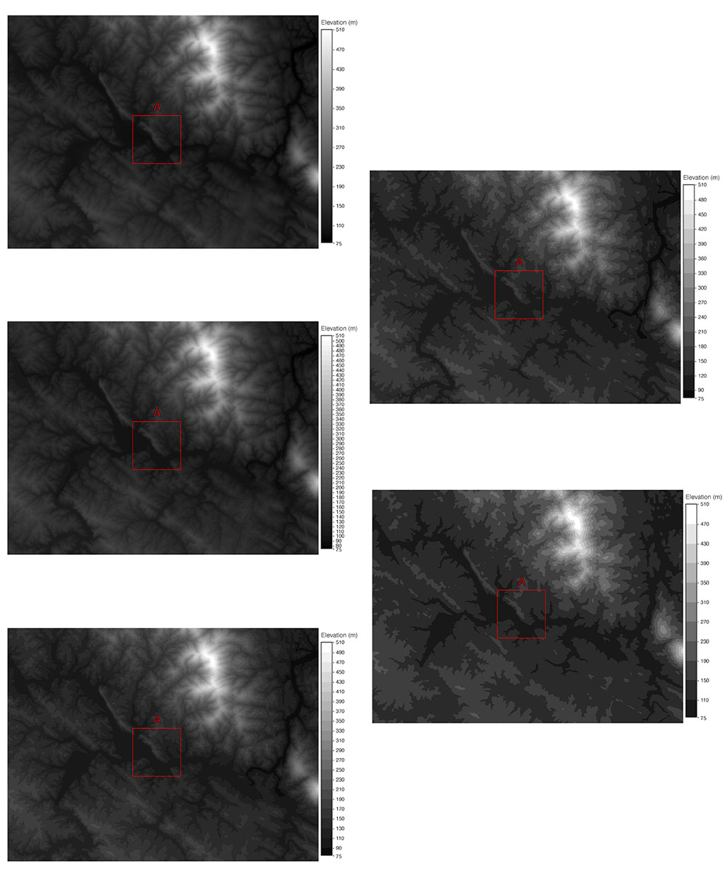
The expressiveness principle for visualization design asserts that a visualization should encode all of the available data, and only the available data, implying that continuous data types should be visualized with a continuous encoding channel. And yet, in many domains binning continuous data is not only pervasive, but it is accepted as standard practice. Prior work provides no clear guidance for when encoding continuous data continuously is preferable to employing binning techniques or how this choice affects data interpretation and decision making. In this paper, we present a study aimed at better understanding the conditions in which the expressiveness principle can or should be violated for visualizing continuous data. We provided participants with visualizations employing either continuous or binned greyscale encodings of geospatial elevation data and compared participants’ ability to complete a wide variety of tasks. For various tasks, the results indicate significant differences in decision making, confidence in responses, and task completion time between continuous and binned encodings of the data. In general, participants with continuous encodings were faster to complete many of the tasks, but never outperformed those with binned encodings, while performance accuracy with binned encodings was superior to continuous encodings in some tasks. These findings suggest that strict adherence to the expressiveness principle is not always advisable. We discuss both the implications and limitations of our results and outline various avenues for potential work needed to further improve guidelines for using continuous versus binned encodings for continuous data types. [paper] |
|